Vans is a famous California-based company that makes sports shoes and clothing. It appeared in 1966 when Gordon C. Lee, James Van Doren, and Paul Van Doren opened a small shoe store. They also managed the factory and were fully responsible for the production process. Since 2004, Vans has been owned by the large company VF Corporation.
Meaning and history
![]()
This brand is widely known among youth and athletes. And all because it was originally aimed at those who lead an active lifestyle, first of all, skaters. Even their first logo first appeared on a skateboard, and only then did they begin to represent it on shoes.
1966
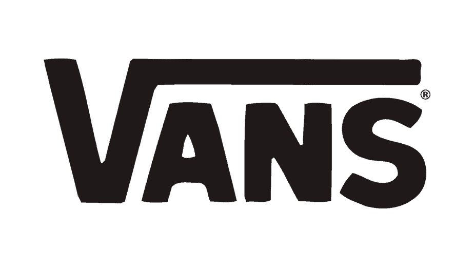
Vans’ debut logo was invented by 13-year-old Mark Van Doren, the son of one of the founders. He made a template to spray paint on skateboards. James Van Doren immediately noticed this graphic sign and affixed it to the heel of the Style 95 shoe. The owner of the company then decided to seriously engage in the manufacture of skate shoes.
The logo contains the inscription “Vans”, which seems unusual due to the long horizontal line above “A”, “N” and “S”. The line starts from the top point “V”, so the letter resembles the mathematical sign of the root. This is an important aspect of design, which has become the main element of the brand’s visual identity.
2016 – Present
![]()
In 2016, developers made the word “Vans” red. The bright color symbolizes joy, energy and passion. The white background conveys aesthetic purity and sophistication. The red and white palette is diluted with the black “Off the Wall” inscription below.
The story of their appearance dates back to the mid-1970s. California skaters Tony Alva and Stacy Peralta discussed at the store Jeff Ho Surfboards and Zephyr Productions how they rode in an empty pool. Tony boasted that he had managed to turn against a wall and fly through the air. And then admirer Skip Engblom exclaimed, “Man, you just came out of the wall.”
Van owners have decided to perpetuate a catchy phrase in their logo. At first, she was depicted against a small skateboard that looked like a turtle shell. For this image they called it “turtle”. A little later, the word “Vans”, designed by Van Doren even earlier, was added to the phrase “Off the Wall”. The combined trademark was used only on skate shoes. All other things were decorated with an emblem with the company name.
In 2016, designers revised the previous design by removing the skateboard and leaving the verbal part. But if at first the inscriptions were uneven, now the font is strictly unified: all the letters are capital and symmetrical. The dashes are equal in width and length. No serifs at the edges: most lines end at right angles.
Color
![]()
The bright color symbolizes joy, energy, and passion. The white background conveys aesthetic purity and sophistication. The red and white palette is diluted with the black inscription “Off the Wall,” located underneath.