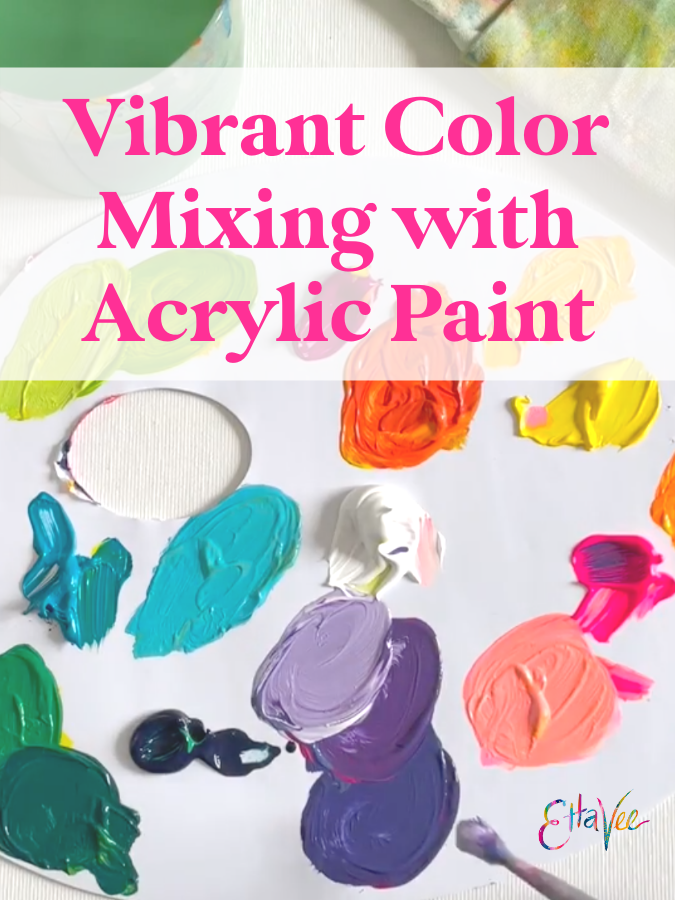
Vibrant Color Mixing with Acrylic Paint
The EttaVee brand was born out of a need for vibrancy and color in my life. It was winter in Paris, and while Paris is one of my favorite cities in the world it can tend to be a little…gray. Especially in the winter! So I started painting with the vibrant colors that my soul was missing in those dreary months.🎨 🌈
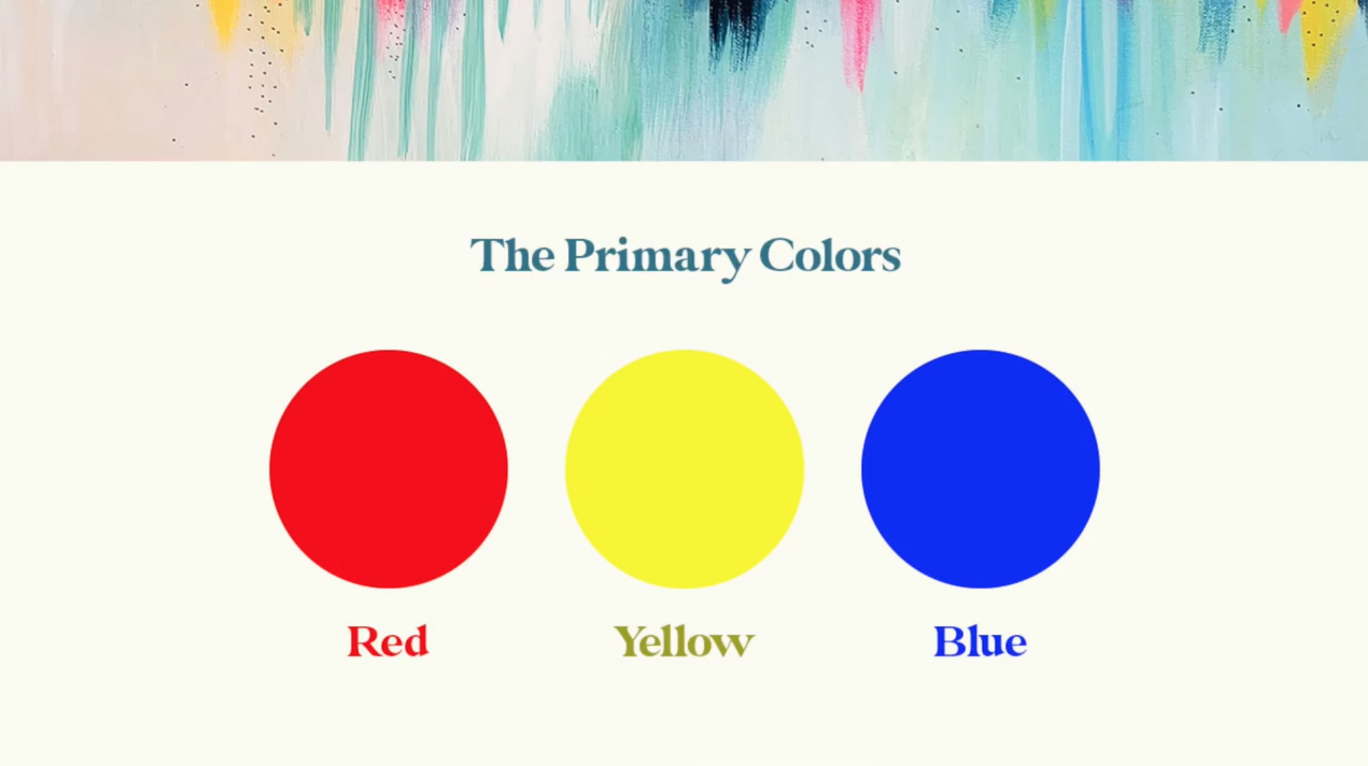
Before I dive into more detail about mixing vibrant colors, here’s a super quick color theory overview. The primary colors are the foundational colors for mixing, and the colors that most artists start with. When mixed, the primary colors make secondary colors and together those shades make up the classic colors of the rainbow: Red, Orange, Yellow, Green, Blue, and Purple.
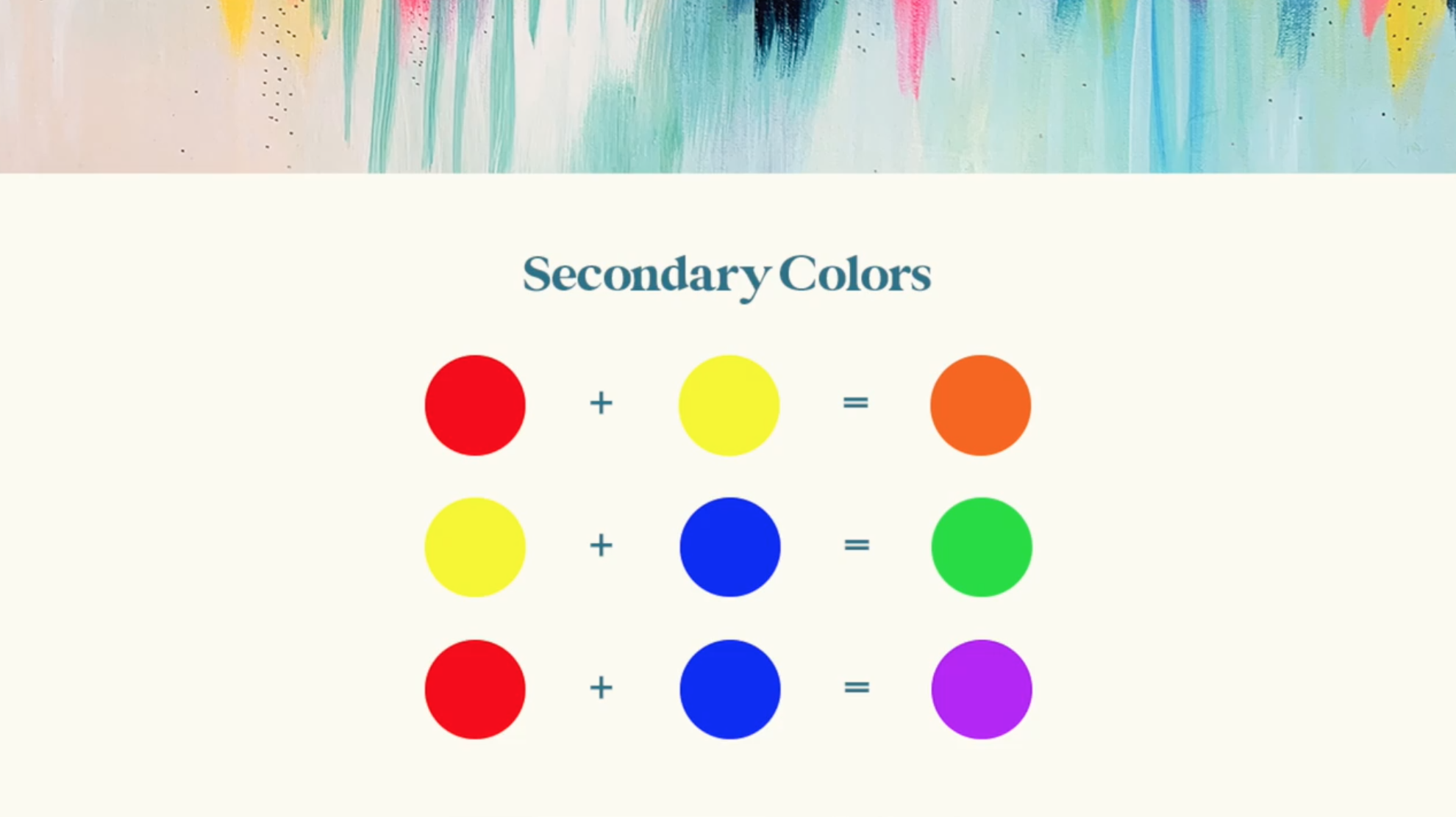
This visual shows how to mix the primary colors to create secondary colors.
Primary Red + Primary Yellow = Orange
Primary Yellow + Primary Blue = Green
Primary Red + Primary Blue = Purple
There is a lot more that goes into color theory, but those are the basics that you’ll need to know for our purposes in this post!
When EttaVee began during that dreary winter, I broke out my acrylics to paint and I started with the classic primary colors - Primary Red, Primary Yellow, and Primary Blue.
But when I painted with colors mixed from red, yellow, and blue, I noticed that they were lacking the vibrancy and rich tones that I was craving. They turned out to be kind of muddy, so I made it my mission to find acrylics that I could mix to create the vibrant hues I was looking for.
After plenty of experimentation, I’ve found my favorite color combinations for mixing vibrant colors with acrylic paint. In this post I’ll share my favorite color combinations and walk through how you can create a rich and vibrant rainbow with just six paint colors.
If you want to follow along with this tutorial, I’ll share the exact paint colors I use to create vibrant tones in my artwork. But I’d encourage you to always be experimenting and finding your own version of the primary colors that speak to your soul!
My Favorite Primary Colors:
Turquoise Blue
I use Turquoise Blue instead of Primary Blue. It’s dark enough to create beautiful deep shades for cooler colors, without them verging on looking muddy.
Quinacridone Magenta
This is my alternative to Primary Red. This Magenta can still produce beautiful and rich shades, but unlike Primary Red, it helps bring the colors more towards the “jewel tone” space. I use a lot of purples in my work, and primary red can sometimes be a bit too warm and it muddies up the purple. Magenta is a great alternative because it is already mixed with the warmth of the red but incorporates some of the cooler tones as well.
Primary Yellow
I stick with the basics when it comes to yellow. It is bright enough to create vibrant hues and mixed with the magenta and turquoise it produces great results. If I ever need to add more vibrancy to a warm tone, I tend to add a fluorescent color to help make it pop. You’ll hear more about my go-to fluorescent in the next section!

My Favorite Secondary Colors:
Titanium White
Titanium White is a staple for any artist to have in their acrylic collection. It is my go-to for lightening up my mixed colors. Plus, if you add the tiniest bit - even to a dark color - it can help bump up the opacity of the paint.
Fluorescent Pink
This is a staple in the EttaVee studio! I love using this gorgeous hot pink on its own, but it is my secret weapon when it comes to vibrant color mixing. If my mixed colors are looking a little duller than I’d like, I always add a touch of fluorescent pink to brighten them right back up.
Prussian Blue
With Prussian Blue, a little goes a long way. This dark blue helps deepen cool tones. I never mix with black paint because that’s just a recipe for dull and muddy colors! But with Prussian Blue, you get depth without the hue becoming too dark.
Now that you know my favorite vibrant colors, let’s start mixing!
Tips for color mixing
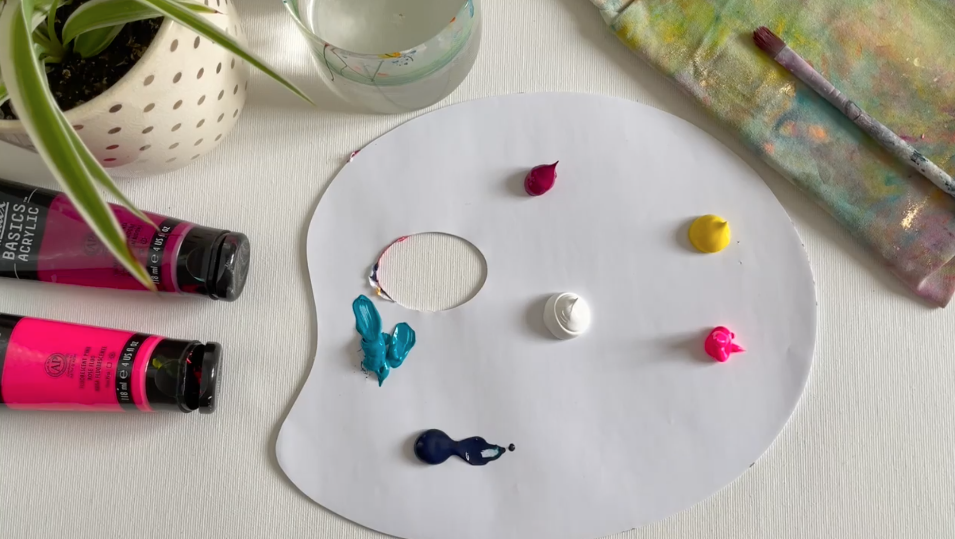
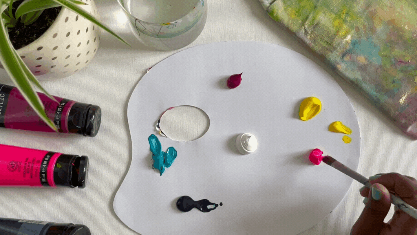
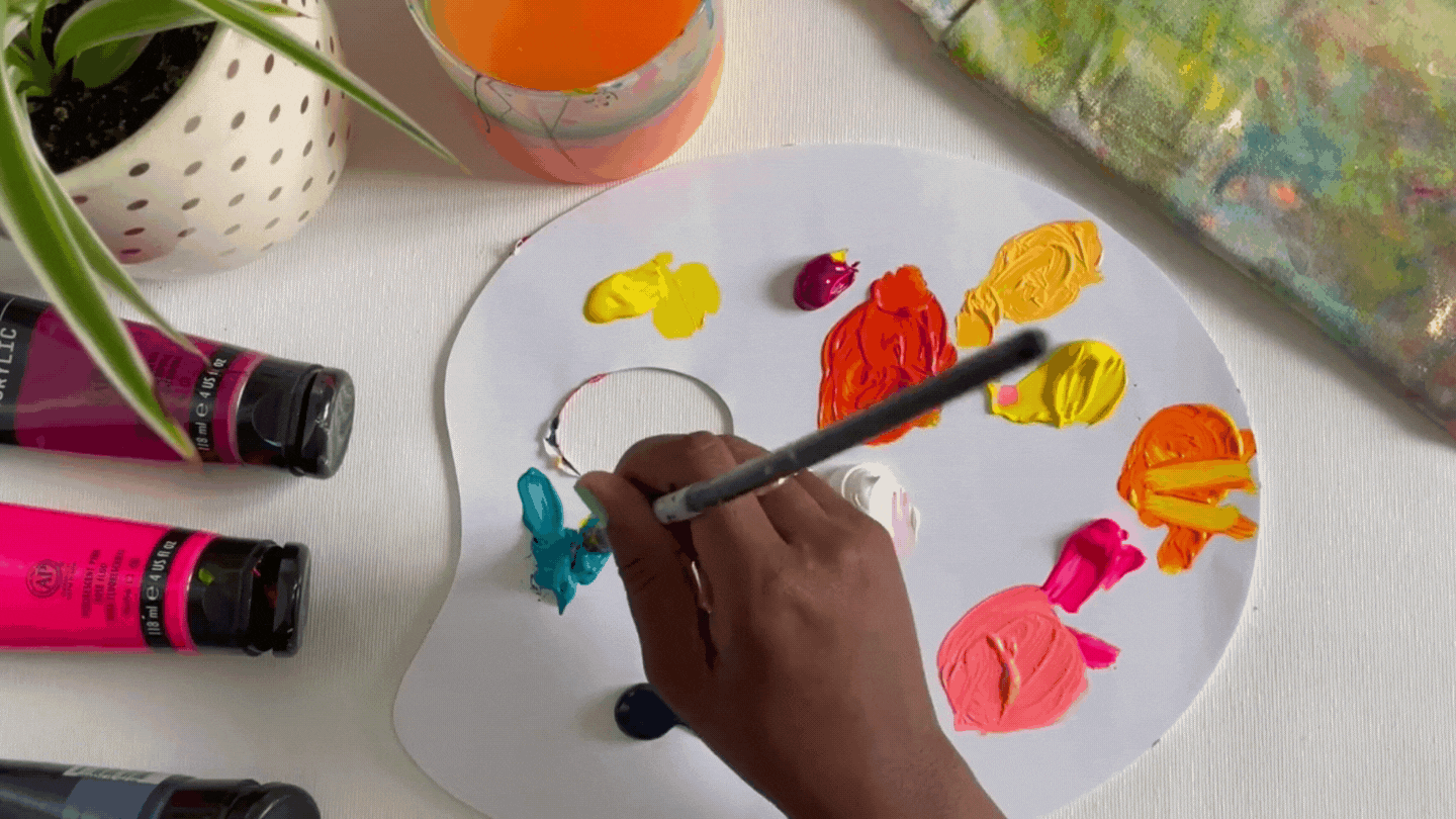
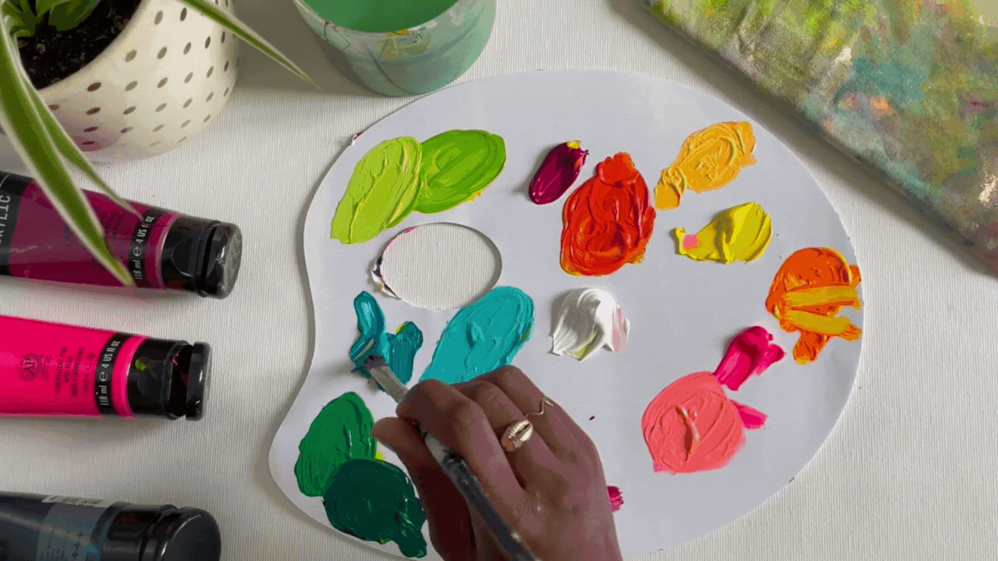
I like to start by spreading all of my main colors out on my palette. This gives me plenty of room to mix the new colors. I put my titanium white in the middle so it’s easy to pull it in any direction. From there, I spread my other main colors out across the palette. You’ll want to use larger amounts of the primary colors and smaller amounts of the secondary colors (namely Prussian Blue and Fluorescent Pink. A little goes a long way with those!). Here is what my palette looks like before I start mixing.
Some people prefer to mix their paints with a palette knife, but I use a paintbrush. Either one works, it just comes down to personal preference.
My general rule of thumb is to start my color mixing by pulling in the lightest color first and then adding the darker color slowly until I reach the color I’m looking for. This isn’t a hard and fast rule, but is a good place to start if you’re new to color mixing so you don’t darken your colors too quickly.
Mixing Warm Colors:
Vibrant Orange
Grab some of the Primary Yellow and add a tiny bit of Fluorescent Pink to create a vibrant orange.
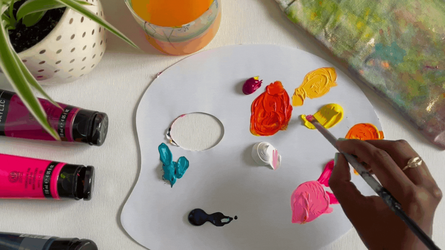
Light Orange
To create a light orange, take a little bit of that newly mixed orange, and add Titanium White.
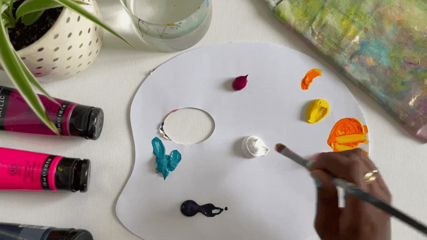
Dark, Vibrant Orange
For a darker orange, start with Primary Yellow and add the tiniest bit of Magenta to it. As I mentioned, I like to start with the lighter colors and slowly mix in the darker ones. Once your color has gotten darker it’s hard to lighten it up. Add dark tones little by little so you have more control over the color you’re creating. The dark orange I mixed up was taking on more of a marigold color, so I added some Fluorescent Pink to brighten it up and bring it back into the vibrant space.

Hot Coral
One of my favorite colors to use in my artwork is a beautiful hot coral. It brings me so much joy! To get this color start with Fluorescent Pink, add a bit of Titanium White, and then add in the tiniest bit of Primary Yellow.
Mixing Cool Colors:
Bright Green
To mix a green start with Primary Yellow and add a tiny bit of Turquoise to it. A little goes a long way, so be sure to add the Turquoise little by little so not to darken the green too quickly.
Pastel Green
If you want a lighter green, simply add a little Titanium White to the green you just mixed for a more pastel look.
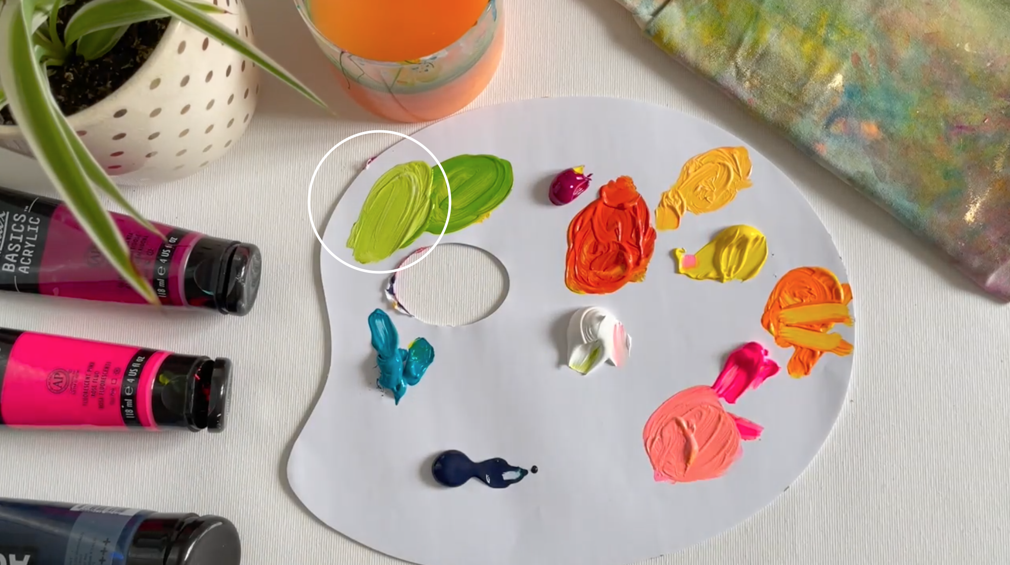
Kelly Green
To achieve a darker green, mix Turquoise and Primary Yellow like before, but this time add more turquoise to get a darker cooler tone.

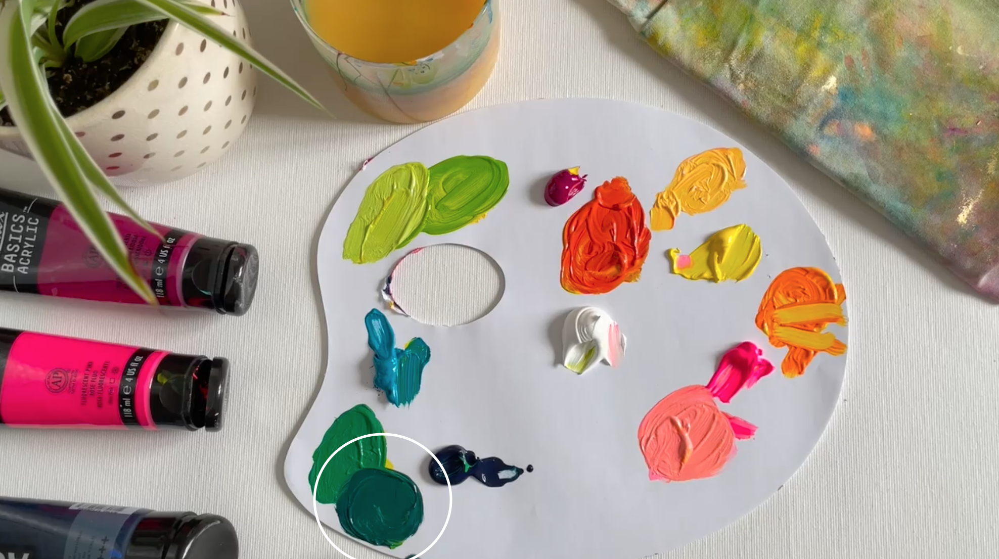
Deep Teal
To go even darker, add a little bit of Prussian Blue to the kelly green color.
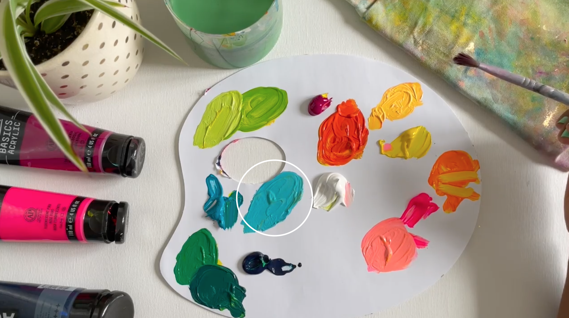
Light Turquoise
For a blue variation, you can start with Titanium White and pull in a little Turquoise. This will give you a lighter variation of the Turquoise straight out of the tube.
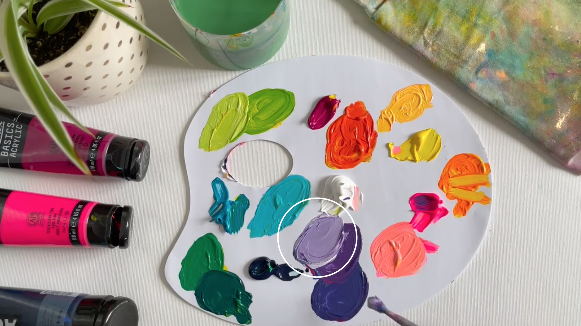
Purple
My go-to eggplant purple is achieved by mixing a good amount of Magenta with a tiny bit of Turquoise.
Warm Purple
If you want to warm this purple up a bit, just add some (...you guessed it!) Fluorescent Pink!

Light Lavender
To achieve a light purple, just add a little bit of Titanium White to the warm purple.
With that, you have a whole gorgeous rainbow of vibrant colors to paint with! The only limit to color mixing is your creativity. I would encourage you to start with these colors to get comfortable, but feel free to explore and find your favorite vibrant colors!
xo, Jessi
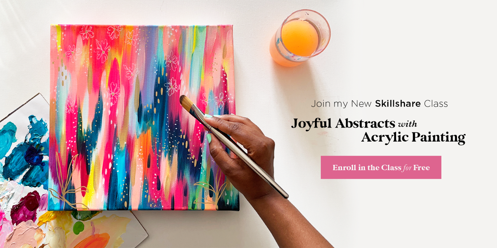
Want to learn how to paint an abstract painting with these beautiful colors?
Join me in my Skillshare class, Joyful Abstracts with Acrylic Painting! In this class I share my step-by-step painting process. I’d love for you to join me and create your own Joyful Abstract! If you’re new to Skillshare you can enroll in the class for free! Plus you’ll get a free month trial of Skillshare so you can check out all of the amazing creative classes on the platform.
Pin this post for later! 📌
Hover or tap on this image and click the “Save” button on the top left!