
The Modern Primary Colors
There is a (relatively) new color wheel in town, and a new set of primary colors that make it turn:
Magenta, Yellow, and Cyan
Upon being exposed to this new information, artists tend to fall into one of the following camps:
Camp 1: "Yah, I know, like, duh"
Camp 2: "Yes, and it means your ENTIRE CHILDHOOD WAS A LIE!"
Camp 3: "Wait, what?"
Camp 4: "You know... Red, Yellow, and Blue really never did mix ALL of the other colors, now that I think about it..."
Camp 5: "No, you're WRONG"
Me? I’ve moved through most of the camps and have finally arrived at a state of acceptance (I'm not much of a 'yeah, duh' sort of person though, and I've never thought ill of my elementary school art teachers.).
It's difficult and strange to rethink such a foundational lesson. The primary colors are practically the ABC's of art!
If you're new to this theory, it helps to think more in terms of an addition to basic color theory, rather than a dismantling and rebuilding.
While some painters are abundantly aware of this take on color theory, to many others it is breaking news. When I learned these, it revolutionized the way I painted and saw color, so I want to make sure to share it here in the way I wish I would have learned it:
Basic Modern Primary Color Theory
The modern primary colors are Magenta, Yellow, and, Cyan. With these three colors (and Black) you can truly mix nearly any hue. With the three modern primaries alone you can mix an exciting array of beautifully vibrant secondary and intermediate colors (which are mixed from a secondary and a primary).
But here's the real shocker: these colors can mix both Red and Blue.

So, it really is time to re-think the color wheel!
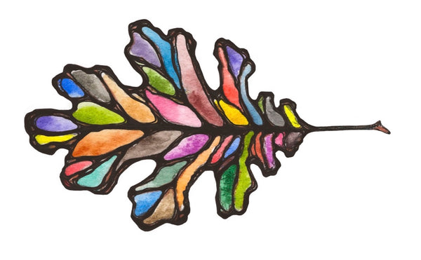
If you still don't believe me, just check under the hood of your printer. These are the same colors your printer uses to reproduce all of the colors you can see on your screen!
Natural Pigments vs Modern Primary Colors
So next I naturally wondered, "Can these modern primary colors really mix the dazzling array of natural pigments that we produce in any kind of faithful approximation?" (Hint: the answer is yes!)
To put these modern primary colors through their paces, I wanted to see how closely they could match the natural pigments in our color line, and how closely they measured up to the results of my printer!
 Of course, there are noticeable differences between the printed scan, the painted pigments, and the hues mixed with CMYK colors. Primary colors are tools of approximation. But to have a leap in accuracy and ease is something to take note of and celebrate!
First, I painted swatches of a spectrum of our colors made with natural pigments (center). Next, I scanned them and printed them out to see how the printer would do reproducing these with its limited four ink cartridges (left). Last, I pulled out the CMYK Set (see below), which contains our new Magenta, Yellow, Cyan, and Grey Ochre to quickly paint up some mixtures to match each swatch (right).
To be clear, when you mix colors you are creating an approximation or hue (which refers to the appearance of the color). Color characteristics can't really be mixed. There will always be a difference when painting with, say, a mixed Malachite Hue or Malachite Genuine. Paint made with pure, genuine, natural Malachite will always appear and handle differently than a mixed Malachite Hue. Why? They are different materials and therefore have different handling properties. The molecular structure is different, giving different shape to each individual pigment particle, and pigment particle sizes can vary widely. Malachite pigment will catch the light differently and spread across the page differently. Which option is best for you depends on your preferences and your work.
Our Colors
Since last year, we have been testing pigments and mixing up test batches of paint to create our own versions of the three modern primary colors: Magenta, Yellow, and Cyan.
To be in the G&B color line, these new colors needed to be lightfast, very low toxicity, useable with natural pigments, and gorgeous.
Unfortunately, the natural palette does not yield a natural true Magenta, Yellow, or Cyan. Our new colors contain synthetic single pigments bound to a natural mineral base.
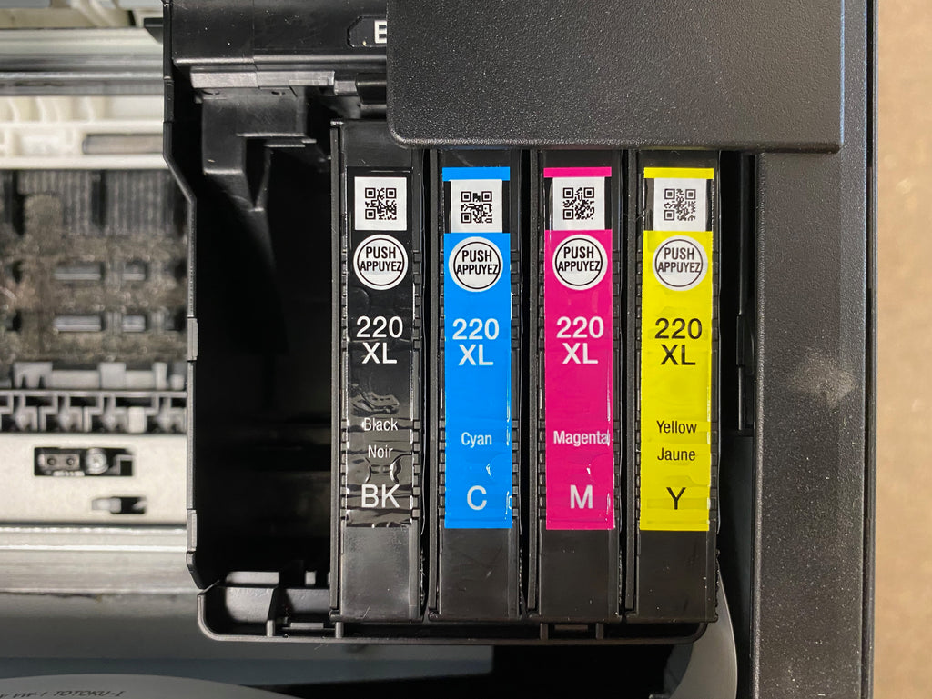
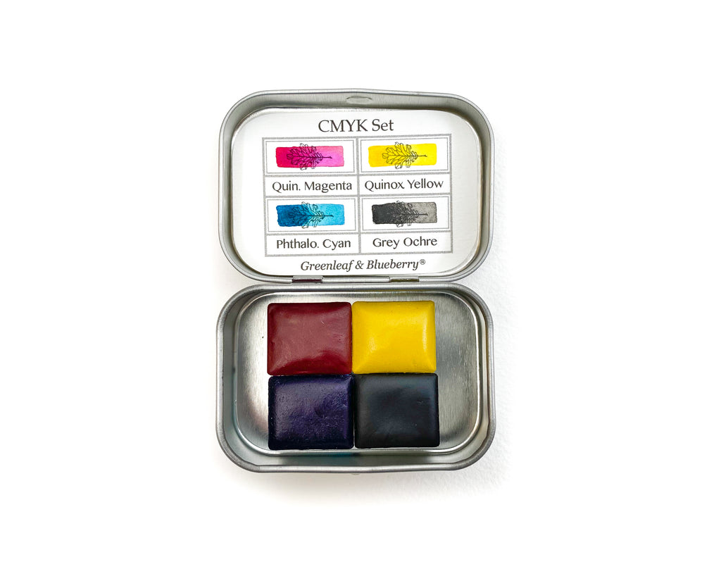
Introducing the G&B Modern Primary Colors:
Quinacridone Magenta
Quinoxalinedione Yellow
Phthalocyanine Blue
Our colors are always named for the pigment that makes them. Synthetic color names are often unruly enough that they benefit greatly from abbreviation, or nicknames. So, we refer to these as Quin. Magenta, Quinox. Yellow, and Phthalo Blue.
When in stock, they can be purchased individually, in a trio called the Modern Primary Trio, in a quad (that includes black) called the CMYK Set, in a quintet called the CMYKW Set that includes the addition of the opaque Titanium White to offer you a full range of tinting options to your primary set, and a more multipurpose palette called the Sketcher's Set. (Each of these sets is available in Full Pans Sets too.)
Are Red & Blue Secondary Colors?
Finding that hues we typically label as "Red" and "Blue" can be mixed has cause some people to conclude that Red and Blue are actually our Secondary colors instead of Orange and Purple, which I believe is demonstrably inaccurate (examples below).
Color terminology is specific enough that we have a better way of describing the rightful places of Red and Blue on the wheel: not as Primary or Secondary colors, but as Intermediate colors. Intermediate colors are made by mixing a Primary and Secondary color together.
So Red's rightful place is between Magenta and Orange, and Blue's is between Cyan and Purple.
But rather than just taking me at my word, let's mix up some colors:
Below is a color pyramid using our modern primary colors, with Red and Blue in the Secondary color positions (usually occupied by Orange, Green, and Purple).
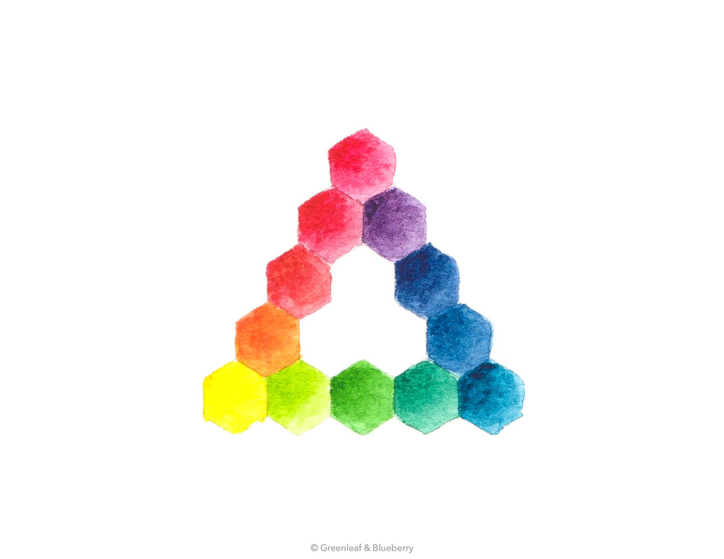
Is there anything you notice about this color pyramid?
It is imbalanced, displaying color transitions that are incrementally uneven. As you move from one hexagon to the next, the degree of change from hue to hue should be consistent. But you notice that the transitions from Magenta to Red and from Cyan to Blue are so gradual that some of the changes are barely recognizable, whereas the transitions from Red to Yellow and Blue to Magenta are very pronounced.
Now, let's take a look at another pyramid:
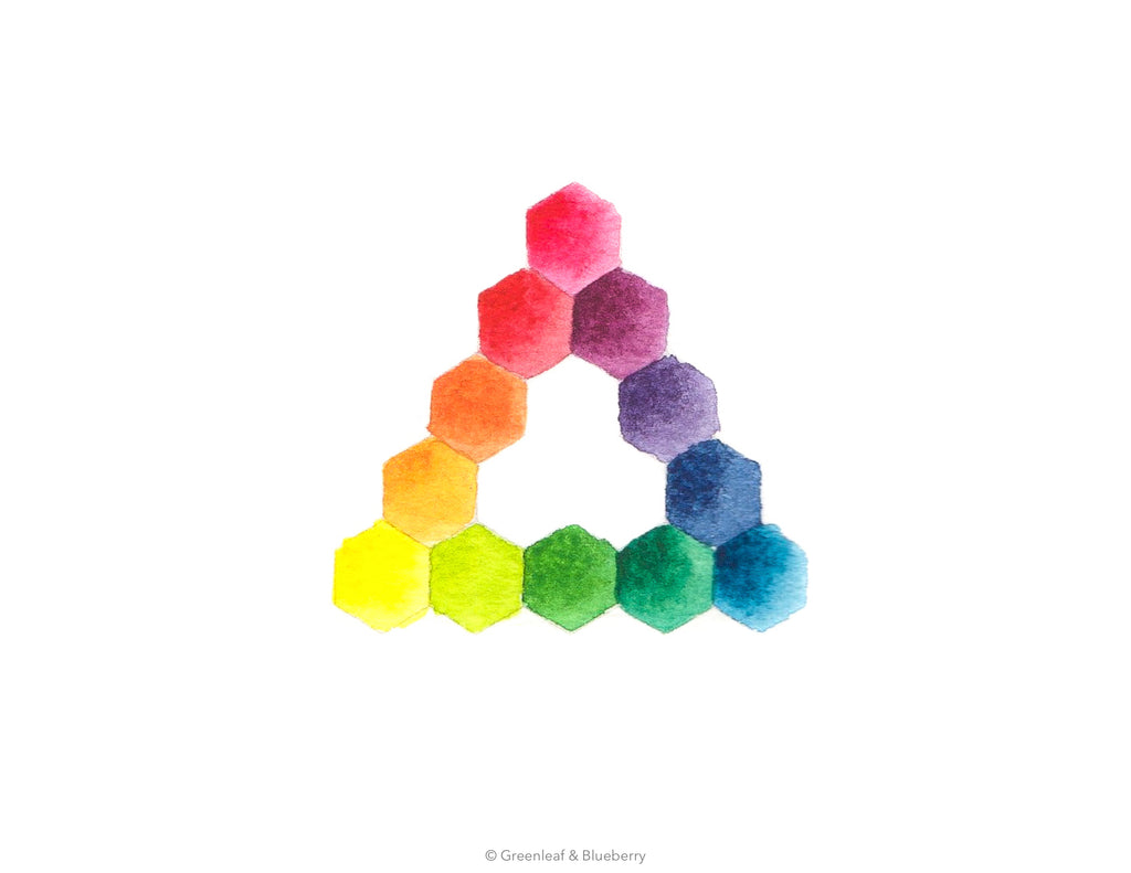
What do you notice here?
These transitions are all quite consistent. Red and Blue are in the intermediate color position, leaving the traditional secondary colors in their traditional places (and the world can keep making sense).
So, nothing has really been turned on its head, we have just improved the accuracy of an older model by adding in new information. Most elementary color wheels do not portray Intermediate colors. By having more accurate terms (Magenta, Cyan, and Intermediate), and slightly expanding the basic portrayal of the color wheel, we have a working model that is applicable to color mixing, where the older model showing only Primary and Secondary colors with Red, Yellow, and Blue in the primary positions has left many budding and experienced artist on the brink of despair.
To summarize:
The Modern Primary Colors are Magenta, Yellow, and Cyan.
Red and Blue are Intermediate Colors.
Orange, Green, and Purple are secondary Colors.
And I'm going to take it a step further with this diagram and name the rest of the oft-overlooked Intermediate Colors to complete our vocabulary and our color pyramid:
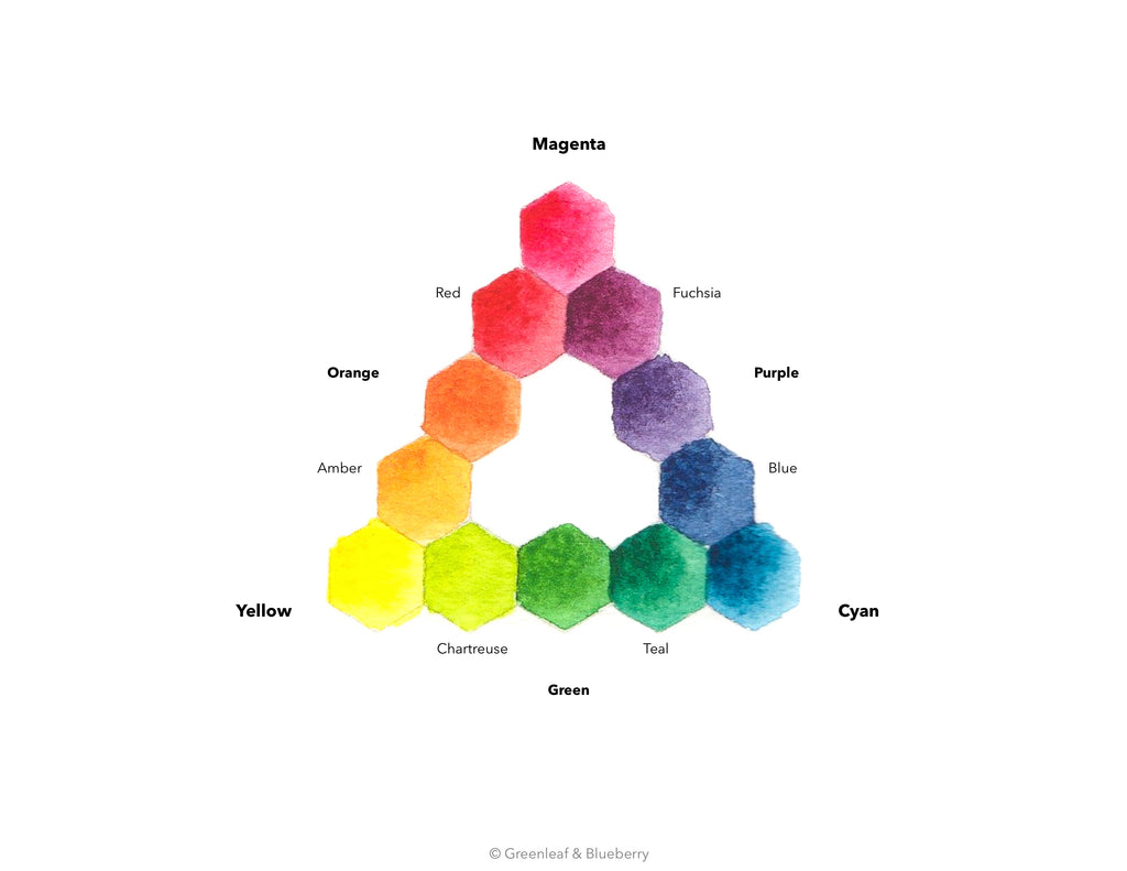
The naming of colors is a fascinating but confusing topic. Color names can describe hue, a material, or what a material looks like. You can say a daffodil is yellow or you can describe a certain yellow as daffodil. It would help if there was a bit more of a standardized system for the most basic color names. Above is is the one I use.
I find it most helpful to have hue-specific names, such as the ones on the pyramid above, and then accurate pigment names. When mixing my watercolors, I make selections of pigments to create different hues, thinking of each by their names. For example, if I wanted to mix a Chartreuse, I would think to myself, "let's begin with a pool of Quinox. Yellow, and add just a touch of Phthalo. Cyan."
Many of the basic color names we use today (such as Red, Blue, Purple, Orange) are understood to refer specifically to color, which can eliminate the subjectivity and confusion of my above daffodil example. But, it should be said that all color names originate in description once you get into the etymology. Red came from the word for blood, black from ink. For orange, which came first the color or the fruit? Indeed, the fruit came first!
As a person who deals with the minutia of color on a regular basis, I standardized the basics for my own sake. I hope you find it useful!
What about Red, Yellow, and Blue?
The good news? You do not need to throw out everything you learned about the Traditional Primary Colors. Just add the new lesson to the file. I find that it helps to think in terms of Red, Yellow, and Blue as color categories instead of as specific colors. If you think of Magenta as a color that falls under the category of Red, and Cyan as falling under the category of Blue, then the traditional theory still holds. Just know that if you really do want to mix "all of the other colors" as the song says, then you will need specifically Magenta, Yellow, and Cyan (any Red, Yellow, or Blue-hued colors will not yield the same clean, bright results of Magenta, Yellow, and Cyan). If you have other versions of the primary color categories you will still be able to mix all kinds of different colors though!
Where Does Color Temperature Fit In?
Color Temperature is a system all about guiding you through using different varieties of Reds, Yellows, and Blues. (I wrote a blog post all about it here.) If you understand color temperature then you will be able to quickly and predictably mix the hues you want with a wide variety of different primary colors. The thing to remember here is: there are many different "primary" color combinations. You can use Red Ochre, Yellow Ochre, and Vivianite (Blue Ochre), or Pipestone, Limonite, and Mayan Blue, or Cadmium Red, Cadmium Yellow, and Ultramarine Blue. Maybe you have all of those colors in your palette. Understanding color temperature will help you understand how to mix all of those different colors to achieve the results you want.
These different theories and systems aren't mutually exclusive. They work together nicely. If you don't happen to have Magenta, Yellow, and Cyan in your palette or you don't enjoy working with synthetic pigments, then that's okay! By understanding this concept and color temperature, you'll be able to use the colors you have in your palette already to great effect.
Why Are We Only Learning About Modern Primary Colors Now?
How did color theorists of the past "miss" these colors? As I mentioned above, Magenta, Yellow, and Cyan don't really exist on the natural color palette. The pigments for them have only been invented more recently, so the old masters, scientists, and color theorists of the past simply didn't have access to them. I could get into more detail about light waves, the physiology of the human eye, and a dash of chemistry, but I'll save that kind of fun for a future post! The moral of the story is that color theorists of the past weren't wrong, they just didn't get to work with all of the information that was yet to be discovered. We stand on their shoulders.
Modern Primaries Are Your Secret Weapon
These modern primary colors are perfect for creative minimalists, artists who prefer to travel light, and anyone really wanting to take a dive into color theory. They can also be an excellent foundation to a new palette you build from scratch. If you begin with these three primaries you can then add the other colors that you use most to save you the trouble of mixing them (called convenience colors, often Greens and Purples, or colors with specific handling characteristics you enjoy, such as Ultramarine Blue with its granulating properties). You can also tuck them into your current palettes as a way to fill in any holes in a pinch!
Here is how I have them nestled into my current palette:
 In addition to Quin. Magenta, Quinox. Yellow, and Phthalo. Cyan, I have Ochre colors, Minerals, some Historical colors such as Potter's Pink, and even Faux Gold. Colors with a more intense tinting strength are in little Shells, while colors with a weak tinting strength or that I use a lot of are in Full Pans. I enjoy using my Modern Primary colors more to adjust and tint hues when mixing, and use other colors, such as Ochres as the mixing base. For more on how to build a palette from scratch, click here.
No matter where they fit in for you, I hope you have a good time getting to know these new colors.
As Always,
Thank you for reading, and Happy Painting!