Primary Colors and How to Use Them for Interior Design


Primary colors are the foundational colors you can mix to produce a wide range of other colors. The development of primary color theory is long and complex and includes ideas from the physics of light, philosophy, and visual art. This history is distinct for the different types of color, color from the science of light, and color related to natural pigments.
The color of the primary components depends on the type of color model you choose. There are two broad types of color mixing models, the additive and subtractive systems.
Primary Colors for the Additive Color Model

The additive system recognizes the colors red, green, and blue as primary colors. This explains why experts also call this system the RGB model. Many scientists developed this system, including Sir Isaac Newton, who used the visible spectrum of light. He observed that the combination of these three color ranges produced white light and thus named these “primary colors.”
You can also mix each of these primary colors with another to develop secondary colors. For example, if you mix green and blue together, you produce cyan. Newton and other scientists and philosophers experimented with spectral light and the mixing of color. They established the early foundations of the color wheel through the practice of these ideas. Technicians still use the RYB color model for digital media.
| Color | Hex Code | RGB Value |
|---|---|---|
| Red | #FF0000 | (255, 0, 0) |
| Green | #00FF00 | (0, 255, 0) |
| Blue | #0000FF | (0, 0, 255) |
Primary Colors for the Subtractive Color Models
The subtractive color models rely on the colors that are created by subtracting certain wavelengths of light. These are the models that we use for objects that do not reflect light. There are two types of subtractive color models including the model used for print, the CMYK model and that used for fine art and the traditional color wheel, the RYB model.
| Color | Hex Code | CMY Value |
|---|---|---|
| Cyan | #00FFFF | (0, 255, 255) |
| Magenta | #FF00FF | (255, 0, 255) |
| Yellow | #FFFF00 | (255, 255, 0) |
CMY and CMYK Model

The CMY and CMYK models are the ones that printers use to create different colors of ink for printed media. These primary colors are C for cyan, M for magenta, Y for yellow, and K for black. Printers use the “K” designation for black to differentiate it from blue and to signify the key plate, which provides a visual reference for the other colors. Printers developed these methods in the early 20th century to take advantage of the subtractive qualities of color to produce a much wider range of printer color than was possible before. The CMYK model is still the most widely used model in printing today.
RYB Model

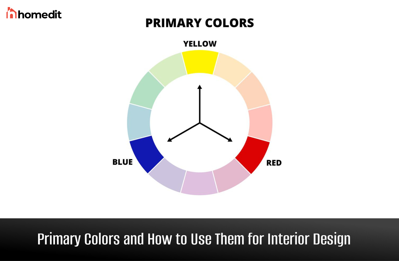
Visual artists developed and have used traditional color theory mediums, such as the color wheel, to help them understand and use color pigments rather than the light spectrum. Red, blue and yellow are the three primary colors in traditional color theory. Newton’s experiments with colors led to the development of the color wheel. But it was “The Art of Color,” published in 1961 by Johannes Itten under the influence of Bauhaus, that led to the widespread adoption of red, blue, and yellow as primary colors in art and design.
Problems with Primary Color Theory
Part of the primary colors definition is that you can mix these three prime colors to create all the other colors. This definition is not accurate. You can use primary colors to create many other colors, but you cannot use the base colors in additive or subtractive color models to create all the colors in the world.
Primary colors themselves are not pure colors. In other words, the color that you create from various primary colors are affected by the particular pigments in these colors. For example, certain pigments of red will contain more yellow or more violet and will produce a different color when mixed with a secondary color. Likewise, a Prussian blue color will produce a deeper and more muddy color than one mixed with peacock blue, which has more green pigmentation.
Which Color Model Do Interior Designers Use?
The traditional color theory model is the most important color idea that designers use in interior design. This means that they use red, blue, and yellow as primary colors. Even though you cannot use these 3 primary colors to mix every color in existence, red, blue and yellow are important building blocks for design.
How to Use Traditional Primary Colors to Develop a Color Scheme
Designers use the color wheel in traditional color theory to determine a color scheme for a particular room. You can use different methods to develop a color scheme based on the primary colors, including pairing a primary color with a complementary or analogous color, using a triadic method to use all three primary colors, or using one primary color to create a monochromatic color scheme.
Primary + Complementary Colors

You can use primary colors plus colors that are directly opposite them on the color wheel to develop a workable color scheme. These are bold combinations that might not suit everyone. Try adding a substantial amount of a neutral shade like white, cream, or gray if you want to try one of these striking combinations but feel like it might be overwhelming in your home.
- Red + Green – The combination of red and green is not just a holiday combination but a pairing that works to balance the intensity of red with the soothing qualities of green. Think beyond the strict primary shade of red to complement green tones. Instead, consider rich shades of burgundy with deep forest and silvery sage greens. Or, for an eye-catching combination, try a poppy red with a soothing mint green.
- Blue + Orange – Blue and orange is another unexpected but logical pairing. The cool shades of blue soothe the warmth of orange to counter its intensity. Consider different shades of blue rather than just its primary interpretation to come up with the best blue/orange color schemes. Navy and burnt sienna make a gorgeous pairing, as well as lighter shades like sky blue and coral.
- Yellow + Purple – For a chic but unexpected color scheme, try yellow and purple. Think beyond primary yellow and purple and consider the varied shades of both, from deep ochre yellow to rich aubergine purple. Again, add in enough neutral tones to mitigate the brilliant color if you want a more laid-back scheme using these two colors.
Primary + Analogous Colors

Using analogous color schemes, interior designers use the colors that are closest to one dominant color. With three colors, it is best to use the 60-30-10 rule. In other words, use one color the most, with a secondary color used in a supporting role and the last color showing up in small amounts throughout the room.
- Red – To find the analogous colors for red, look beside red on the color wheel. For an analogous red color scheme, pair with either orange and yellow or look to the other side and pair it with purple and blue.
- Blue – Blues analogous colors include green and yellow on one side or purple and red on the other side.
- Yellow – The analogous colors for yellow include green and blue and orange and red.
Primary Colors: The Triadic Method

The triadic method of color pairing is created by using a color scheme with hues that are spaced equally on the color wheel. For all the traditional primary colors, it is the other two primary colors that are their triadic match. Many people dislike using the three primary colors of red, blue, and yellow together to create a cohesive color scheme because they see them most often in children’s spaces. Yet, used in more sophisticated shades of each primary color, this can create a stylish and grown-up interior space.
Monochromatic Color Schemes

Interior designers create monochromatic color schemes by using colors within the same family group. For example, pairing reds with other lighter or darker shades of red is a monochromatic color scheme. We create these varying shades by adding white to create lighter tints of a particular color or black to create other distinct shades. Some people find monochromatic color schemes soothing, but other people consider them boring. The best way to create a dynamic monochromatic color scheme is to use multiple shades and tints of color with distinct textures and prints to add interest.
- Shades and Tints of Red – Popular shades and tints of red include maroon, burgundy, crimson, poppy, madder, garnet, vermillion, pink, coral, cinnabar, and scarlet
- Shades and Tints of Blue – Popular shades and tints of blue include navy, midnight, sky, cyan, turquoise, aqua, royal, slate, cornflower, and cerulean.
- Shades and Tints of Yellow – Popular shades and tints of yellow include canary, daffodil, ochre, lemon, butter, mustard, honey, and gold.